Barbara,
In reference to you original posting about the origins of the tail seen in
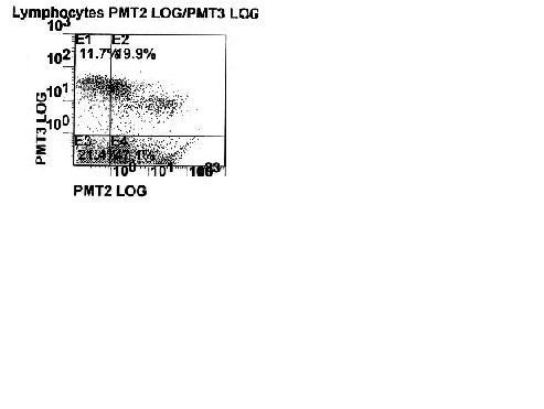
your AnV-FITC vs CD8-PE plot I think that it is a compensation issue. The
FITC signal looks undercompensated from the PE, but I wouldn't go so far
as to say it is "really bad". In fact, it doesn't really affect your
quadrant statistics at all since the entire tail is in a single quadrant.
It just doesn't "look" right. You mention below that it might be
overcompensated. If this was an example of overcompensation, you wouldn't
see the tail. Everything would be squished against the axis. Some might
say that the events to the left of the tail ARE squished against the axis.
They are a little squished, but I think this is because the PE PMT
voltage is a little low. Running with a little higher voltage in all
detectors to pull the negatives a little further from the origin may make
suitable compensation a little bit easier to visualize. I also think you
can rule out autofluorescence. In my experience, problematic
autofluorescence typically shows up as a double positive population that
streaks out from the origin of a two parameter plot. That little curl of
a tail at the high end of the FITC scale just doesn't fit the pattern I'm
used to seeing.
On another note, what about dead cell discrimination? I find it
imperative to use a dead cell discriminator along with AnV to gate out
false positives. What does the rest of the flow world have to say about
this?
David McFarland
GlaxoSmithKline
----- Forwarded by David C McFarland/DEV/PHRD/SB_PLC on 12-Aug-2002 14:46
-----
Barbara_Kutzner@hc-sc.gc.ca
09-Aug-2002 08:39
To: "Cytometry Mailing List"
cc:
Subject: data question - omitted info
Sorry about that folks, it seems I forgot to attach the axis labels to the
plot.
PMT2 is Annexin V -FITC, PMT3 is CD8 - PE. The gate was placed on
lymphocytes
only not all cells.
As it has been asked, I have included all the data plots I have from that
sample
(1.0 Gy) analysis (suggestions were that it may be bleed over from another
channel, that it is over compensated, that the population is too close to
the
axis thereby throwing off compensation)
Original plot 1.0 Gy sample data
(See attached file: flow plot.JPG) (See attached file: 1Gy flow.jpg)
Thanks again,
Barb
____________________
Barbara Kutzner
Technologist
Radiation Protection Bureau
Health Canada
775 Brookfield Road, PL 6303B
Ottawa, ON K1A 1C1
(613) 952-9069
FAX (613) 941-1734

This archive was generated by hypermail 2b29 : Sun Jan 05 2003 - 19:26:18 EST